The Lowdown
We love the four-deck mixing, the addition of portrait mode and the trap cue/loop. But the big change in the look and the sheer depth of functionality may be confusing to some.
Video Review
First Impressions / Setting up

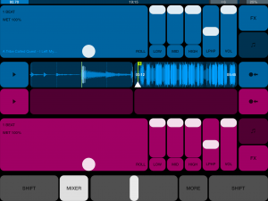
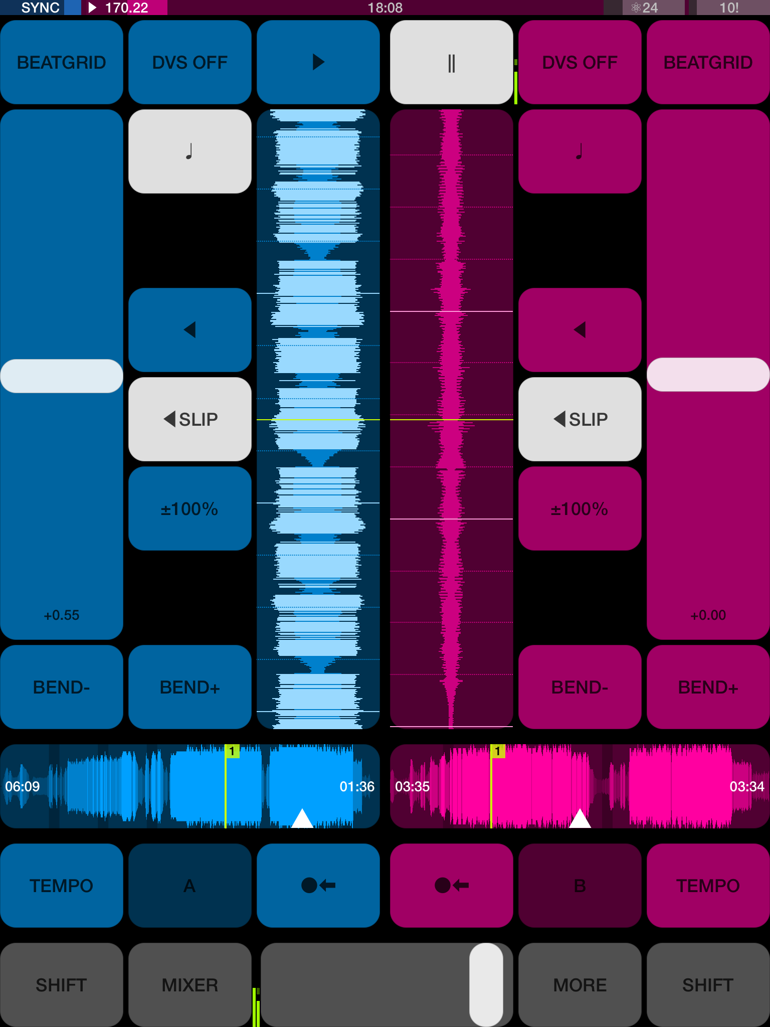
Everything has changed. If you use DJ Player at the moment, you will need to take a while to learn where bits of functionality are now placed and how best to access them. The style has changed from squared off edges on big buttons to more rounded, smaller (but still perfectly adequate) buttons. The big change for me is that I can move my iPad in any direction and the orientation will change – so at last, I can use DJ Player in the Numark iDJ Pro in portrait mode. (Note that this isn’t available if you’re using an iPhone or iPod Touch.)
Each deck has three main screens: FX (FX plus mixer), Tempo (can be switched between grid-based and classic views), and 1-8 (cues and loops). I purposefully said “each deck” because DJ Player now gives you the ability to use four decks, something I know the more creative and dynamic DJs will love. You can enable this via the “More” button on the music library page. Each deck is colour coded so although only two decks are displayed on the screen at a time you can quickly flick between A and C (for one deck), and B and D (on the other).
The result of the restructuring of the interface means that you have access to both decks and the major controls all the time on one page. Other pages of functionality get overlaid, but the key information is always there for you.

The scrolling waveform is larger than on the previous version. If you’re in landscape mode the scrolling waveform takes up half the width of the screen, while the other half is for the overall waveform. If you’re in portrait mode the scrolling waveform runs upwards away from you in the centre section with the overall waveform shown at widthways underneath.
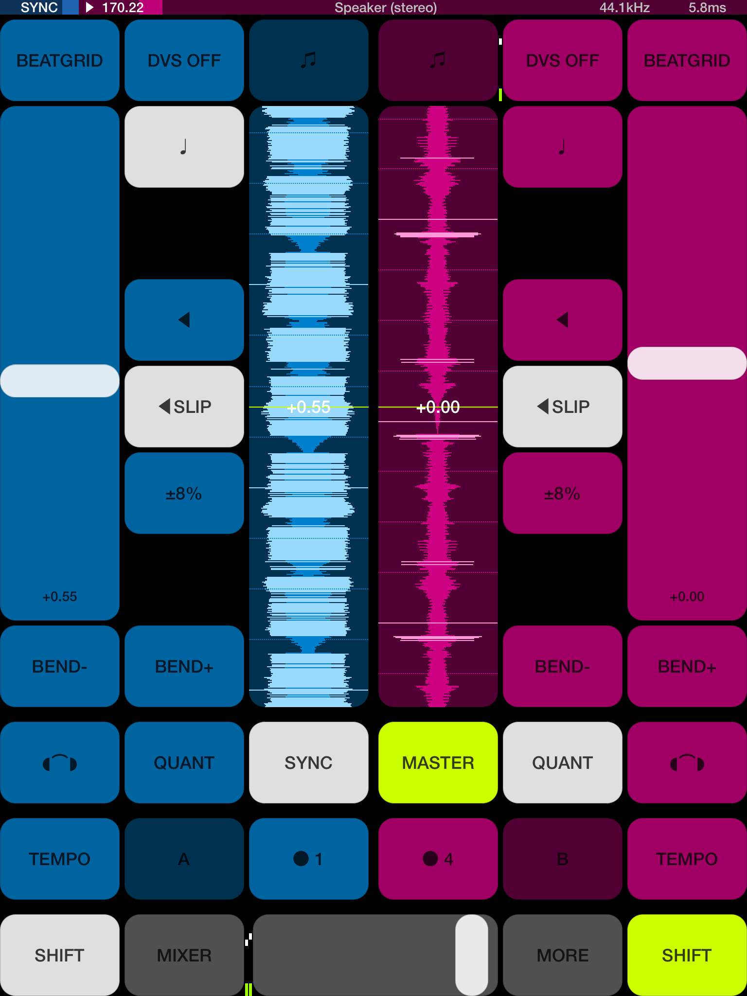
The “Shift” button has always been important with DJ Player to unlock further functionality and it’s no exception with this version. Pressing Shift will display a further overlay, allowing you quick access back to your headphone cueing, quantise, Master and Sync buttons. If you’re on the Mixer/FX page pressing Shift will also show you the other FX that you could choose from.
Although the pages on DJ Player are showing much more, the buttons remain large enough to ensure that even the wobbliest of hands during a gig can hit the right function at the right time. Portrait mode is new in v6 of DJ Player, as such it means that with a simple bit of Midi mapping you can use DJ Player with the Numark iDJ Pro. In fact, once it’s docked the new colour scheme of DJ Player and those large scrolling waveforms give the iDJ Pro a futuristic feel. I’ve uploaded a start point mapping for those who want to do this.
Quantise and sync
The methods of DJing on iOS have changed as well over the four years, so DJ Player now moves along in the way you can match the tempo of two tracks. Quantise and sync are both switched on by default (this can be changed via central settings). The Master deck is auto-calculated based on the position of the crossfader, however, this can also be switched off. Quantise snaps everything to the master deck’s beat. The background of the status bar (along the top of the screen) is set to the Master deck’s colour (another handy pointer). Double tapping on the Sync button will set that deck to be the Master.

Of course, this all depends heavily on how well the BPM is detected and the placing of your beatgrids. So far it’s all been fine for me, I have had to tweak a few drums and bass tracks but that’s par for the course with most apps. A point to note about the beatgrids is that they get stored for the track (along with the cues/loops and BPM value), so when you back up your database all that preparation work has been saved. It also means that if you delete a track from your iOS device and add it back later, a saved beatgrid against it will get remembered.
On the library page for DJ Player, there’s a useful indicator on the far left to show whether a beatgrid is missing for a track or not… another helpful way of showing you what homework you’ve got left to do! If you’re not a fan of all this assistance and want to beatmatch in the classic way, then you can switch all the default settings for quantise, sync and master deck off.
Functionality tweaks
There are a number of other changes that have been made to DJ Player which affect your workflow, for example, if you want to lock an effect on simply tap another finger anywhere on the X-Y pad to turn it on. Repeat this process if you want to turn it off. The eighth cue point now acts as a “trap”. If you set it somewhere that you want the track to end (say perhaps at the start of the last four bars) if it reaches that point it will automatically go into loop mode (assuming you’ve set an out point for the loop) and remain there. Using this you need never worry about a track fading out to silence during the mix!
In Use
I’m a long-term user of DJ Player and as such, I can quickly turn a decent set on a single iOS device using previous versions of the app. It’s going to take me a little while of practice to forget what I’d learnt previously and move around the new interface with the same grace. The new layout means you can keep track of what’s going on both decks with ease and because the screens all follow the same basic layout it feels more logical when moving between them.
The main control buttons remain in the same place and everything feels much more accessible than before. However, I suspect that if you couple DJ Player with a controller then some of the initial navigational learning will be eased. In fact, it feels like there are fewer button presses to get to the most frequent functionality – at least those features I use anyway. The ability to independently multi-task on both tracks without losing focus on the main waveform is quite an achievement.
Conclusion
DJ Player has always pushed the boundaries with DJing on iOS devices and it’s great to see the interface refreshed and restructured like this. The little tweaks in functionality show that iMect is keen to keep pushing the product forwards to something which is useful for DJs, rather than meekly following the crowd. Although the new interface will no doubt improve workflow within a set and add a refreshing splash of colour, I’m fairly confident that the rework for v6 will result in even more goodies to come in the future. There are a number of blank spaces (when pressing Shift) on some screens, so perhaps this indicates available space for iMect to place another button or two in the future?
With more manufacturers interested in iOS compatibility, DJ Player’s position as the pro DJ choice is likely to remain for some time to come. I wonder how long it will be until we see a controller unit branded with DJ Player on the box?


