Set up in 2004, Beatport is easily the most successful specialist DJ digital music store, with plenty of exclusive releases along with the thousands of tracks released each year.
The website regularly underlines its importance as a music discovery tool for digital DJs by hosting stages at events across the US, including at the Winter Music Conference in Miami.
The issue with Beatport
From the beginning, Beatport was regularly criticised for the limitations apparent to users through its running on an all-Flash platform.
I briefly touched on the changeover from Flash to HTML on my site a few days ago, but the bottom line is that in recent years, Adobe Flash has fallen out of favour with internet users due to the proprietary nature of the browser plug-in and the lack of accessibility and control the user has. For example, you can usually stop a page loading by hitting ESC – except the Flash elements, which keep playing. Not to mention that visually impaired customers just can’t use Flash sites like Beatport at all with their screen readers.
With newer versions of HTML, though, developers can do anything that Flash can, and sometimes more – with the bonus that their site will work on iOS (Flash doesn’t work on the Apple operating system). Now Beatport is beta testing a completely new, HTML version of the site that takes advantage of these advances and finally addresses many of the aforementioned concerns, and which has the potential to help to considerably improve the overall music buying experience of digital DJs.
It’s still in invite-only beta, but we’ve had a preview of the site. (Plus, go to the end of the article for the chance to grab one of our 10 beta tester access codes.)
What’s new
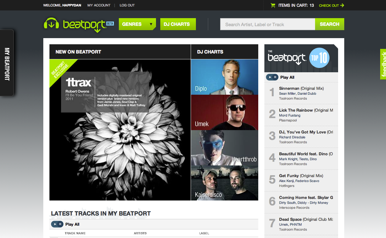
So what’s changed? The most obvious thing is the bolder, airier look to the site. There’s a lot more white space, with larger fonts and more contrast. This makes it a lot easier to navigate and unclutters the user interface.
The front page quickly presents you with the Beatport Top 10, features and a view of the tracks in “My Beatport”, the new name for the artists/labels you follow. These can easily be added to the playlist of the new Beatport Player. You can also see a rundown of new releases and some recommendations.
Speaking of the player, this is now fully HTML, with a waveform you can scrub through and basic controls. It does lack a volume slider right now, but apparently this is in the works. The player now brings your playlist centre stage (rather than cooped up amongst the clutter) and allows you to easily add entire search lists or individual tracks, or remove listened-to tracks.
Beatport has obviously taken a cue from Google with search, and show results as you type. This works quite well, giving accurate results.
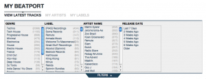
Something I found very frustrating with the old site was the poor implementation of the way you refine your searches. The new site addresses this by letting you filter results further by genre, artist, label and release date. They’ve missed a trick by not implementing the system used in the “My Beatport” filters throughout the search results, as this would make finding tracks with common names much easier.
An addition that’s created some buzz in the webisphere is information on the tempo and key of the tracks. I’m not sure why though, as I can’t imagine ever shopping for tracks based on either. You get a pretty good idea of tempo based on genre (125-135 for techno/house, 140ish for dubstep, 160ish for drum & bass etc.) and as my friend put it regarding keys: “I really love this track! Shame it’s 9A, otherwise I’d buy it!” Not gonna happen…

No change without pain
The changes are a big departure from a look and feel that Beatport has held for a very long time. This will obviously divide current users’ opinion, but as one such user, I’m pleased to report that once you get used to the changes the site flows very well.
Something to bear in mind is that the developers are still adding new things all the time. The site is a work in progress, hence the “beta” label, and you can submit your own ideas and feedback on their uservoice.com page.
Personally, I found the experience from music discovery to checkout as painless as it should be with the only niggles being no way of adding a “Download Code” to get a discount; and the lack of filtering for search results.
Conclusion
Whether you love or hate the current site, this move is definitely a good thing. Flash detractors should definitely try the new site and get involved with feedback, but equally so should fans of the current site. There are threads on the usual DJ forums discussing the topic and swapping access codes, and we’ve got ten Beatport Beta access codes to give away, so there’s really no excuse for the committed digital DJ to miss giving it a go right now!
• Dan Morse is a London, England-based DJ who runs his own DJing blog, It’s a DJ’s life!
Have you ever struggled with Beatport’s Flash interface? Are you glad that the most important online music source for DJs is getting a major overhaul? Have you tried the new Beatport yet? What do you think? Let us know your thoughts in the comments.


