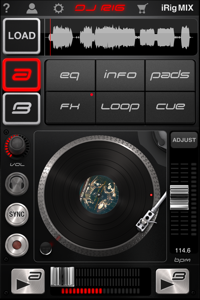
Since NAMM 2012, IK Multimedia (better known for its guitarist-focused products) has been promising a new range of iOS DJ software and hardware, in the form of the iRig Mix (a slimline, portable mixer for iOS devices) and companion app DJ Rig.
The iRig Mix is coming soon (check out our review), but we’ve already had a chance to test the app. With the competitive nature of the market for DJ apps on iPhones, how well does DJ Rig fit in – and has the company learned from the mistakes made in some other, similar apps?
First impressions/setting up
From the marketing videos on YouTube and the welcome screen, you see the DJ Rig app running rather boldly on two iPads either side of the iRig Mix. But when you look at the App Store page it becomes apparent that the app has been developed specifically with the smaller iPod screen size in mind. This is not, then, a “universal app”.
(If you’re not familiar with that term, it means that if you want to run it on an iPad you need to hit the “x2” button to fill the screen. Although the functionality is all still the same, once the graphics have been stretched to the fit a larger screen they become slightly blocked and not as smooth as you might have hoped for. Perhaps in the future IK Multimedia will release a “Universal” update – or perhaps an iPad-only version.)

The main screen shows either two decks (in landscape mode) or a single deck (in portrait). The dual-deck view shows a familiar layout of deck A and deck B side by side with crossfader centred underneath.
The central section shows the volume levels with rotary volume controls underneath. Again, my personal dislike of rotary dials in iOS is gently prodded here, not only with the volume controls but also on the EQ popup as well.
The subject of EQ brings us quickly onto the next question; should I really have to register my email address with IK Multimedia to unlock the EQ functionality (which is included in the initial price of the app)? If your answer to this question is “no”, unfortunately, you’re going to be disappointed since you cannot use the EQ without registering and activating an IK Multimedia account (via email) first.
It’s an unusual move and is likely to prove unpopular, however, IK Multimedia wants to provide better support for its products (including apps) and would no doubt argue that enforcing registration in this way is its method of doing so.
The other controls on the main screen are fairly intuitive, although to load a new track you need to press the “+” icon at the top left of the deck, whereas the button which looks like an eject icon near the bottom is to decide which function you want the button next to the crossfader to control.
The app also offers “In-App Recording” so you can capture your mix on the device immediately. My recommendation on this is to ensure you have plenty of space before indulging in a two-hour set! On completion of recording, you have the option to export the file in a number of different ways.
Instead of EQ, you could have the button set up to display a number of other options:
- Info – shows basic information about the track loaded
- Pads – displays 9 “MPC style” pads to fire one-hit samples
- FX – displays an X-Y “Kaoss Pad” style FX interface
- Loop – on-the-fly looping which can be snapped to the beatgrid
- Cue – up to 4 visual cue points can be stored per track (one as standard)
- BPM – pitch control of the deck and deck nudge control
- Wave – displays the waveform
I can understand why the development team has tried to keep the interface as uncluttered as possible, but with the button next to the crossfader providing access to only one function at a time it was difficult to perform a number of different actions quickly on the same deck.
For example, during a mix I would want to have access to the deck nudge control – especially when tweaking the EQ, looping or applying effects. If I had the EQ controls on the screen and suddenly needed to nudge the deck speed slightly it would take two button presses to get to that functionality.

In use
The app starts to make more sense when running in single deck view when you have more screen space. The waveform is displayed at the top with the six function buttons all displayed and the pitch control positioned to the side. You can quickly switch between decks by pressing the “A” or “B” button at the top. Personally, I preferred using the app in the single deck mode; it was much easier to navigate around and work with.
Along the top of the screen are a number of different icons. The “?” icon loads the help screen where you can have a quick tutorial on how the app works. This is done using 14 annotated overlays to the interface and provides all the information you need to get started with the app.
The user icon requires an internet connection to register the app (and yourself) with IK Multimedia in order to unlock the aforementioned EQ functionality. The next icon takes you to the extensive configuration screen where you can set all the usual detail (crossfader curve, output mode, crossfader filter, pitch adjustment range, auto gain) but also additional settings focused around the use of the app with the iRig Mix hardware.
The unique feature with DJ Rig is the way it uses the in-built mic to sync the BPM of the deck to an incoming audio source. This is only functional when used with the iRig Mix hardware and setup in the Configuration page.
Music library access
Access to your music library is via the standard library screen. I’ve mentioned my distaste for this method before, so I won’t repeat it here.
I would like to at least see the BPM displayed (and sortable) in the library, which is pretty much essential for easy DJing. Ideally, I would see the comment field as well, so harmonic mixing would be possible with information stored in that field.
I’ve got almost 6,000 tracks on both my iPad and iPod Touch; as such the search process was incredibly slow. It’s likely that most customers will not have as many tracks on their device; however, I’ve found performance for track searching on similar apps is much better.
Update: The app is now at version 1.0.2 and the slow library searching issue described above has been fixed.
Cue, FX and looping
A single cue point is available with the app, but this can be extended with an in-app purchase costing US$4.99. The six FX available as standard are a high pass, band pass, low pass, delay, stutter and phazer. The in-app purchase unlocks flanger, crush, compressor, wah, fuzz and reverb. The FX are beat-aligned and can be latched (or locked) on, allowing you to do something else within the app at the same time. They have X-Y control which we really liked.
The loop functionality feels basic when compared with other “small-screen” DJ apps. However, you do get the ability to loop sections of the track on the fly during playback, and these loops can be snapped automatically to the beat grid which gets calculated when the track is first loaded and analysed.
Conclusion
DJ Rig had a rapid release of v1.0.1 shortly after its initial version. This was aimed at stabilising the app and fixing a few minor bugs. (I did experience a few crashes with the app on both the iPad and iPod Touch with v1.0). At v1.0.1 with these measures in place, the app seemed shaky.
IK Multimedia has recently addressed stability issues experienced on older devices and those with larger music libraries with the latest version (v1.0.2) which arrived on the 24th April. This latest update makes the app much more stable to work with. As with all DJ apps, the general advice is to close all apps running in the background and ensure the device is in Airplane mode.
When the iRig Mix hardware is used, the fact that the track BPM can be synced with any audio source, such as a drum machine or sequencer or anything else, could prove to be the winning unique feature the app needs to stand out in the crowd. So check out our review of the iRig Mix, which may help us to make our mind up about the app.
Would you find syncing to an external audio source useful? How large is your music library on iOS? Have you already got this app? Please let us know your thoughts in the comments.


